

So you're building a mobile app. You have done your research and you want to try out React Native but don't know how to start or maybe you just want to revise what you've recently learned. If this sounds like you then you are reading the right blog.
React Native uses the powerful flex layout which makes sure that your application is responsive and consistent regardless of the user's screen size.
Through this series of short articles on each of these flex concepts , you can get a deeper understanding of layouts in react native.
Let's dig in!
Flex
The first thing we need to understand is flex itself. If you have ever used flexbox in CSS, you will get it in no time. Flex simply means flexible to shrink or expand depending on the screen size. When you assign a flex value to a component, you are essentially telling them how much space they can occupy with respect to other elements. An easy way of understanding flex value is to think of it as the space the element takes out of all the space that is available.
Let's take an example similar to the one on the official documentation and break it down
(Click here to try this on Snack)
import * as React from 'react';
import { Text, View, StyleSheet } from 'react-native';


export default function App() {
  return (
    <View style={styles.container}>
      <View style={styles.containerLarge}>
      </View>
      <View style={styles.containerMedium}>
      </View>
      <View style={styles.containerSmall}>
      </View>
    </View>
  );
}

const styles = StyleSheet.create({
  container:{
    flex: 1 ,
  },
 containerLarge:{
   flex:3,
   backgroundColor:'red',
 },
 containerMedium:{
   flex: 2,
   backgroundColor:'yellow',
 },
 containerSmall:{
   flex:1,
   backgroundColor:'green'
 }
});
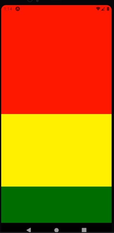
As you can see, here we have 3 views ( which are equivalent to div ) under a single container view. Each of these Views have been passed a style object which tells them two things : the space they should be taking on the visible screen and the background color that they should have. The three styles are - large, medium, small. The style for container tells it only about its flex.
Now let's review the flex that we have provided to the views for them to achieve their specified size. Let us begin with container. This is the parent view and it is not sharing its space with any other view. Providing it the flex of 1 means that all the space on the screen - both height and width , that's available, are for this view to use. So container view spreads to the entirety of the screen.
Now, things are bit different with the three child views that are present in the container view. The three child views are sharing the space of their parent container among themselves. To understand how this distribution takes place, let us first calculate the total flex that these three have together. So that's 3+2+1 i.e 6.
The space that each of these views take will be proportionate to the 6 units of this total space. So for the large container , the total space taken will be 3 units divided by the total 6 units. So we can say that the large container will be occupying half of the screen, while the rest two views will have to share the other half.
Coming to the medium screen, it will be occupying 2 units of the 6 units which means that the space occupied by the medium container is one third of the screen - about 17% lesser space than the large container.
The small container then gets the remaining 1/6 th of the total screen size , thereby, the smallest of the three containers.
Conclusion
Flex allows you to decide the height and width of a react element that is followed across screens and thus giving you a consistent layout for your app. The parent container is assigned a flex of 1 just to let it know that the entirety of the screen is available for it. When the same space is then to be distributed among various elements , the one with the higher flex value will naturally occupy more space.
One last thing to note is that when you are providing a flex to an element, entering a fixed width and height will be counterproductive to your design intentions so avoid doing that.